FinTech compliance co-pilot — pioneered an explainable UI framework to bridge the gap between AI automation and zero-error regulatory audits.
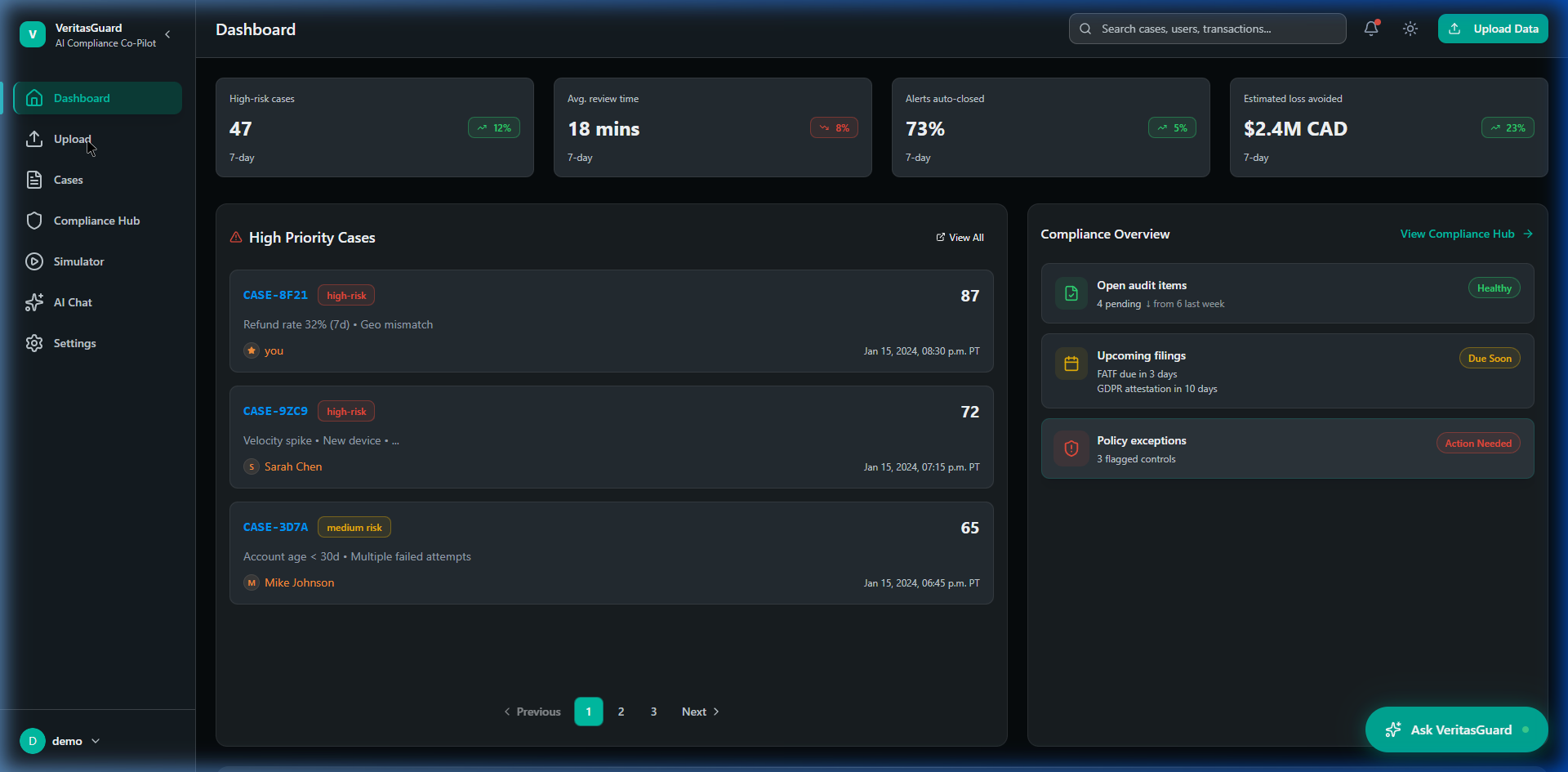
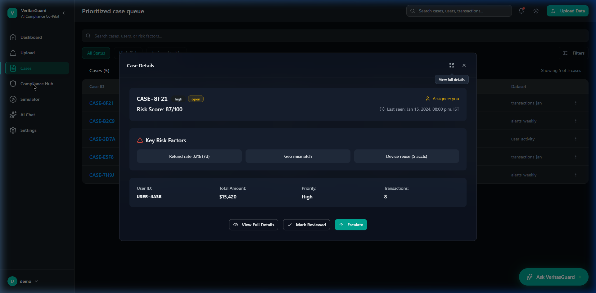
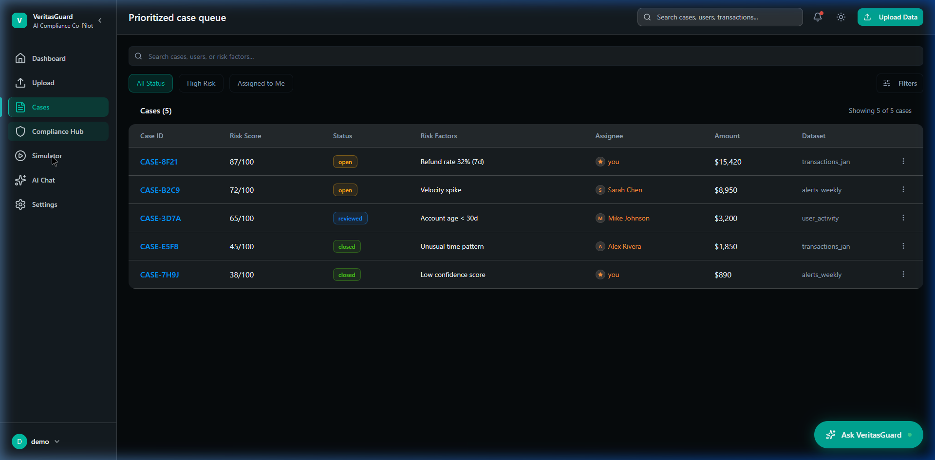
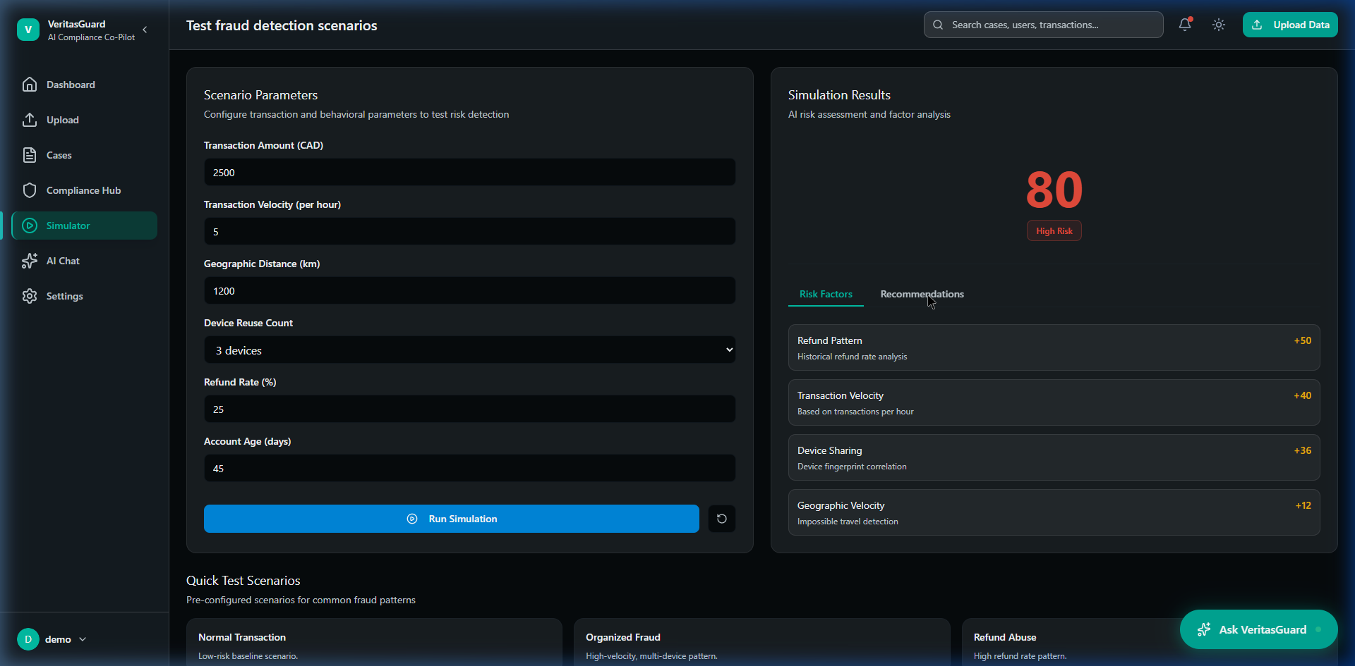
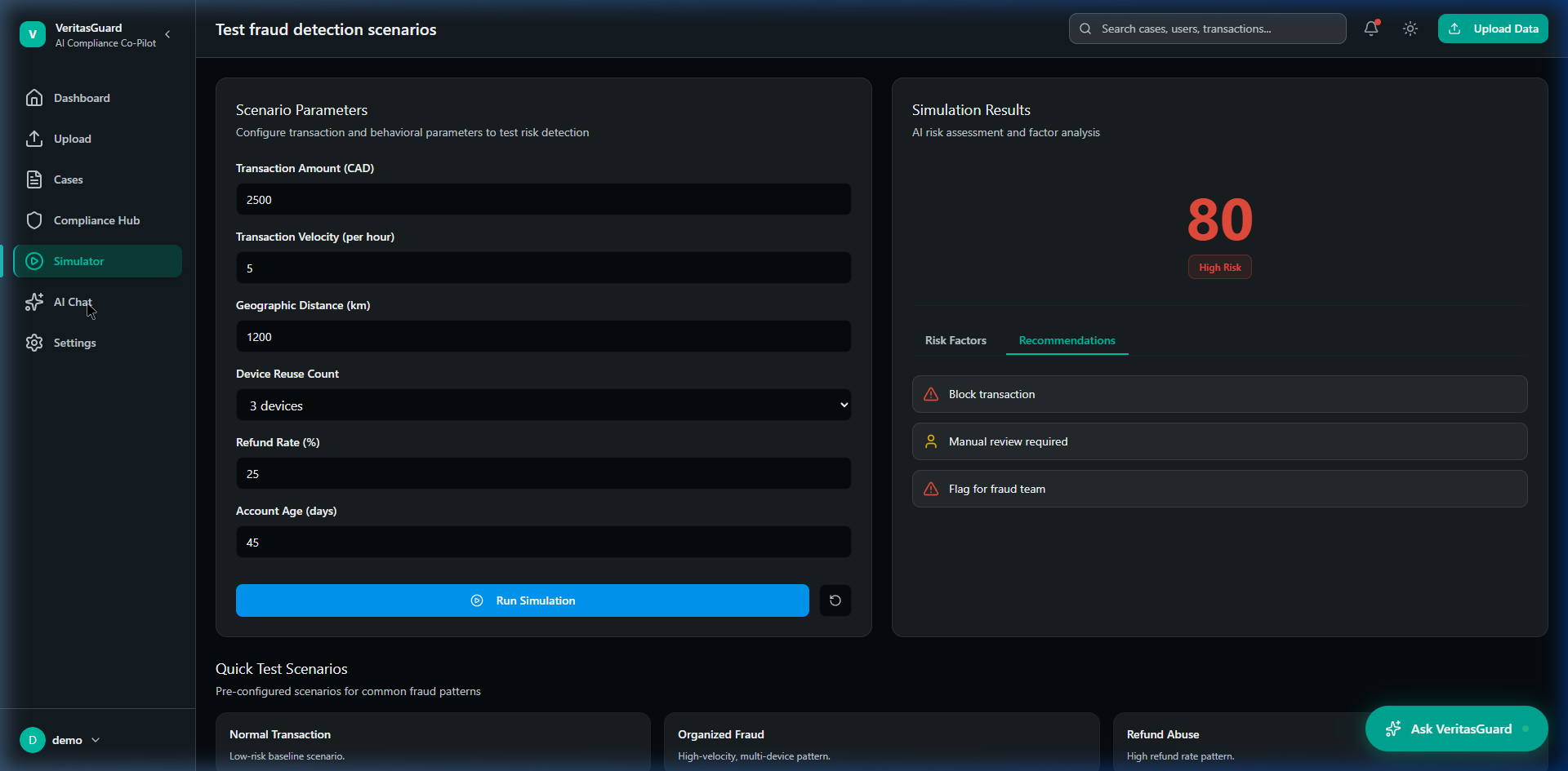
VeritasGuard is an AI-driven compliance co-pilot conceptually designed for banks, fintech platforms, and regulatory teams spanning complex organizational hierarchies. It ingests thousands of transactional data points daily, leveraging AI models to spot anomalies, recognize money-laundering patterns, and flag risk signals in real-time. I led the product design end-to-end to build a platform where compliance teams could seamlessly review and act on machine-generated insights.
In high-stakes financial environments, introducing AI creates a massive trust barrier. Users are instinctively suspicious of black-box algorithms when the penalty for an error is a regulatory fine or a lost audit. Drawing on my enterprise mobile experience at TD Bank, I designed VeritasGuard around explainability rather than automation magic — ensuring every insight delivered by the AI could be audited, verified, and definitively understood by a human analyst.
Early testing revealed that compliance officers were ignoring AI-flagged risk signals entirely and reverting to manual, spreadsheet-based data reviews. They found AI outputs too abrasive and felt that the system was trying to override their professional judgment rather than support it. The system was surfacing outputs, but analysts had zero confidence in how those outputs were generated.
The root cause was architectural: the AI was designed as an oracle, not an assistant. In FinTech, you cannot simply say "the AI flagged this transaction." You must document EXACTLY why it was flagged to pass a regulatory audit. The interface provided the 'what' but completely obscured the 'why', putting analysts in the impossible position of having to blindly trust a black-box model with their company's legal liability on the line.
"The core design challenge wasn't making the AI smarter. It was designing a UI that earned human trust by making the AI exhaustively auditable and transparent."
Conducted deep-dive workflow interviews with 6 senior risk analysts to outline how they currently handle anomaly detection and what thresholds constitute "proof" of an issue.
Reviewed regulatory oversight requirements (KYC/AML) to understand precisely what metadata an auditor expects to see tied to a compliance decision.
Mapped out the emotional fatigue analysts experience when staring at dense, red-heavy error dashboards for 8+ hour operational shifts.
Color psychology matters heavily in FinTech. Red interfaces panic junior staff and create alert fatigue. Risk needs to be presented neutrally and progressively, not urgently, until human verification occurs.
Different roles have radically different needs. A compliance manager needs an aggregate health score; a frontline analyst needs deep transaction-level forensics. A universal dashboard fails both.
"If an auditor asks me why I froze this account, 'the software told me to' will cost us a million dollar fine. I need to see the math."— Senior AML Compliance Officer
Designing a trust-critical FinTech platform requires a rigorous, systematic approach. Here is the exact path I took to reverse-engineer compliance chaos into an elegant, scalable AI product.
I began by dissecting FATF and SOC2 requirements. I interviewed senior compliance officers to map out their primary pain points: alert fatigue and the "black box" nature of existing AI tools. This set the foundational rule: Trust requires explainability.
I structured the platform's core ontology. Instead of a massive data dump, I compartmentalized the architecture into distinct, focused hubs: the intelligent Dashboard for triage, Cases for forensics, and the Simulator for AI tuning. This progressive disclosure was wireframed extensively.
I developed the core interaction pattern: the 'Reasoning Trace'. I designed flows where every AI risk score inherently required a plain-English breakdown of factors (e.g., Velocity Spike, Shared Device) so analysts were validating, not blindly approving.
To combat the visual fatigue of 8-hour shift work, I established a specialized dark-mode-first aesthetic using a controlled forest green palette. I systematically removed abrasive red warnings, building a calm, hierarchy-based layout using Figma components.
As a true hybrid designer, I didn't just hand over flat mockups. I utilized Figma Make to generate structurally sound atomic components, and transitioned directly into Claude Code to scaffold the frontend in React, ensuring zero design degradation in the live MVP.
I designed a core pattern called the "Reasoning Trace." When the AI flags an anomalous transaction, the UI doesn't just show a generic "High Risk" label. It exposes a plain-English, step-by-step breakdown of exactly which rules triggered the flag, what behavioral baseline was broken, and links to the specific underlying data parameters. This decision transformed the AI from an unexplainable black box into a transparent, trusted assistant.
I architected separate yet cohesive views for frontline analysts compared to compliance managers. Frontline analysts saw deep forensics, case queues, and investigation tools. Managers saw aggregate risk exposure, team productivity metrics, and bottleneck alerts. This reduced the cognitive load for everyone by stripping away tools they legally shouldn't be using anyway.
I intentionally removed heavy usage of the color red. In financial compliance, relying on red creates a culture of panic and alert fatigue. I used a muted, structured hierarchy where risk signals were contextualized and ranked (e.g., using amber, neutral grays, and structural spacing) so users could assess severity logically rather than emotionally.
I designed the workflow so the AI could never independently execute an action (like freezing an account). Every escalation required a human approval check with an integrated internal note system. This baked human accountability into the core product architecture, satisfying the strict documentation requirements of regulatory bodies.
By prioritizing explainability and human oversight, the VeritasGuard design successfully bridged the gap between cutting-edge AI detection models and the rigorous, conservative reality of financial compliance. The final product was a developer-ready MVP architecture that positioned the platform uniquely in the RegTech market — selling trust and clarity rather than just "faster AI automation."
Qualitatively, bringing in the strict, production-ready sensibilities I honed at TD Bank meant the product felt immediately credible to enterprise stakeholders, establishing a strong foundation for future B2B sales conversations and platform scaling.
This project solidified my belief that AI is a UX problem, not just an engineering problem. The most brilliant machine learning model in the world is useless if the end-user doesn't feel safe clicking "Accept." Designing for VeritasGuard taught me how to intentionally build "friction" back into an interface — slowing the user down just enough to ensure they are making a conscious, legally sound decision.
If I were to expand the scope further, I would lean into designing how the system handles false positives over time. Building a dedicated feedback loop interface where analysts can quickly train the AI to ignore edge-cases would push the product from an "auditable tool" to a truly "adaptive intelligence."